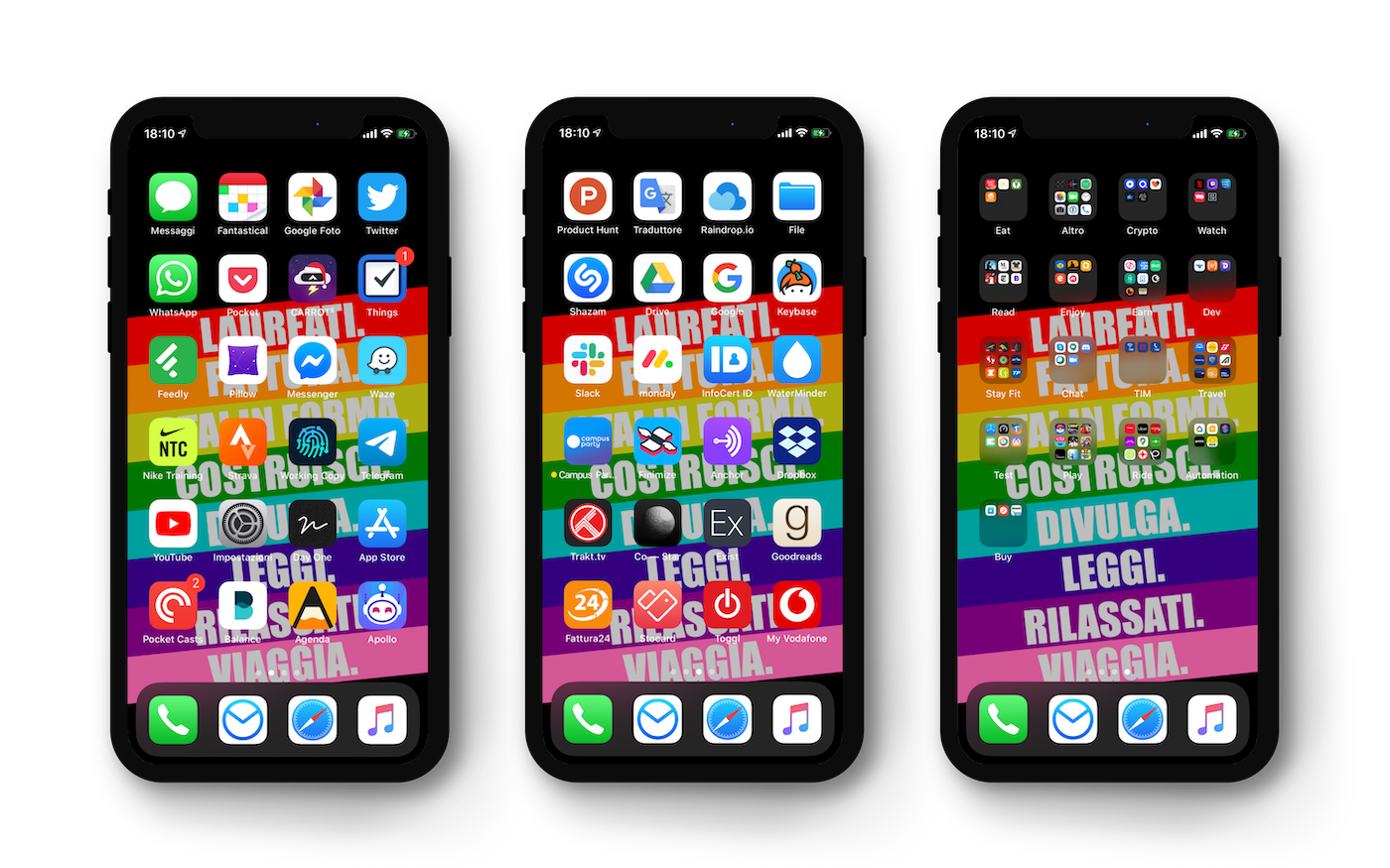
Homescreen 2020 - iPhone
Reading Time: 5-7 minutes
Download wallpaper for iPhone X (HD)
Over time, I tried to figure out how to place icons on my smartphone to be more efficient. I tried arranging by color, by usage, by category, by naturalness of vision (= the most used arranged in an F, because the brain uses the eyes to read a page in this way).
All this worked, but only in specific circumstances: I realized that I was never sure how they were arranged, and I questioned the arrangement very frequently. But I never found a shared framework to decide how to arrange icons, questioning the layout even once a day. In short, I tried to answer the question “how to arrange icons and understand when it is time to change?”
I published many posts over the last year and a half, describing the changes, and after thinking about it for a long time, I believe I have found a universal method that everyone can adopt: I don’t know what to call it yet, so it will be the Universal Method for Arranging Icons on the Smartphone (UMAIS).
As a main requirement, one must think of arranging the icons in a maximum of three pages + a widget page. This method, for now, I have only tested on the iPhone because on Android smartphones there are too many extra variables (freely positionable widgets, variable number of rows and columns, type of launcher used). There are however some cues and reasoning that can also be applied to Android smartphones.
The images that are present on this page, moreover, will be updated frequently during the year, to reflect changes to my homescreen. I still have to figure out how to show the change of individual pages, but I will think about it later.
As a second requirement, instead, one must ‘clean’ the smartphone of unused apps. It can be done in two ways:
- Delete all apps whose icons show the cloud symbol next to the name: they are those apps that we haven’t used for more than a certain period of time. This feature can be activated from Settings -> iTunes Store and App Store -> Offload Unused Apps. If we haven’t used them for a long time, the chances that we will use them in the future are very few.
- Remove all little-used apps by checking the list from Settings -> General -> iPhone Storage.
Once this is done, the icons must be arranged according to three different systems, one per page.
Main page: frequent
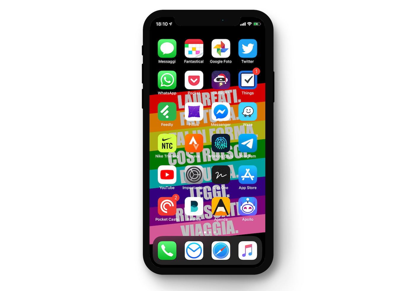
The first page is dedicated to frequent apps, i.e. apps that
- are already used frequently
- are used at the first unlock of the smartphone in the morning
- that we would like to use more frequently.
For example, there are periods when I want to use Twitter more frequently than Instagram and Facebook. To do this, I must force my unconscious behavior, putting Twitter on the front page and deleting Facebook and Instagram. Moving social network apps to another page has little effect, because basically we are very ‘attached’ to our habits of scrolling the feed and seeing what others are doing, and so we would look for the app everywhere to be able to open it. Or even worse, we would look for it directly from the search bar.
So, do I want to listen to more podcasts? I put Pocket Casts, or Podcast. Do I want to have the habit of looking for news on Reddit? I put Apollo. Do I want to train more? I put Nike Training Club and Strava. And so on.
The main page is also the page of the apps we use during our morning routine. My morning routine, for example, includes 3 minutes of meditation, reading emails and the Good Morning Italia briefing, selecting the most relevant news from my feed on Feedly and, sometimes, running (with Strava) or a short workout (with Nike Training Club).
Personally, then, I use two methods for arranging icons on this page: basically the same color on the columns (first column green, second white, etc.) and for ease of touch - Things and Telegram, for example, are absolutely the apps I use most during the day, and they are at the center of the right column, which is the one most easily reachable by my thumb when holding the smartphone. In the middle of the apps in the right column there is Waze, which is my road navigation app: it must be easy for me to open it while placing the smartphone on the car mount, and that is the best position to do so.
Second page: rarely used and to avoid
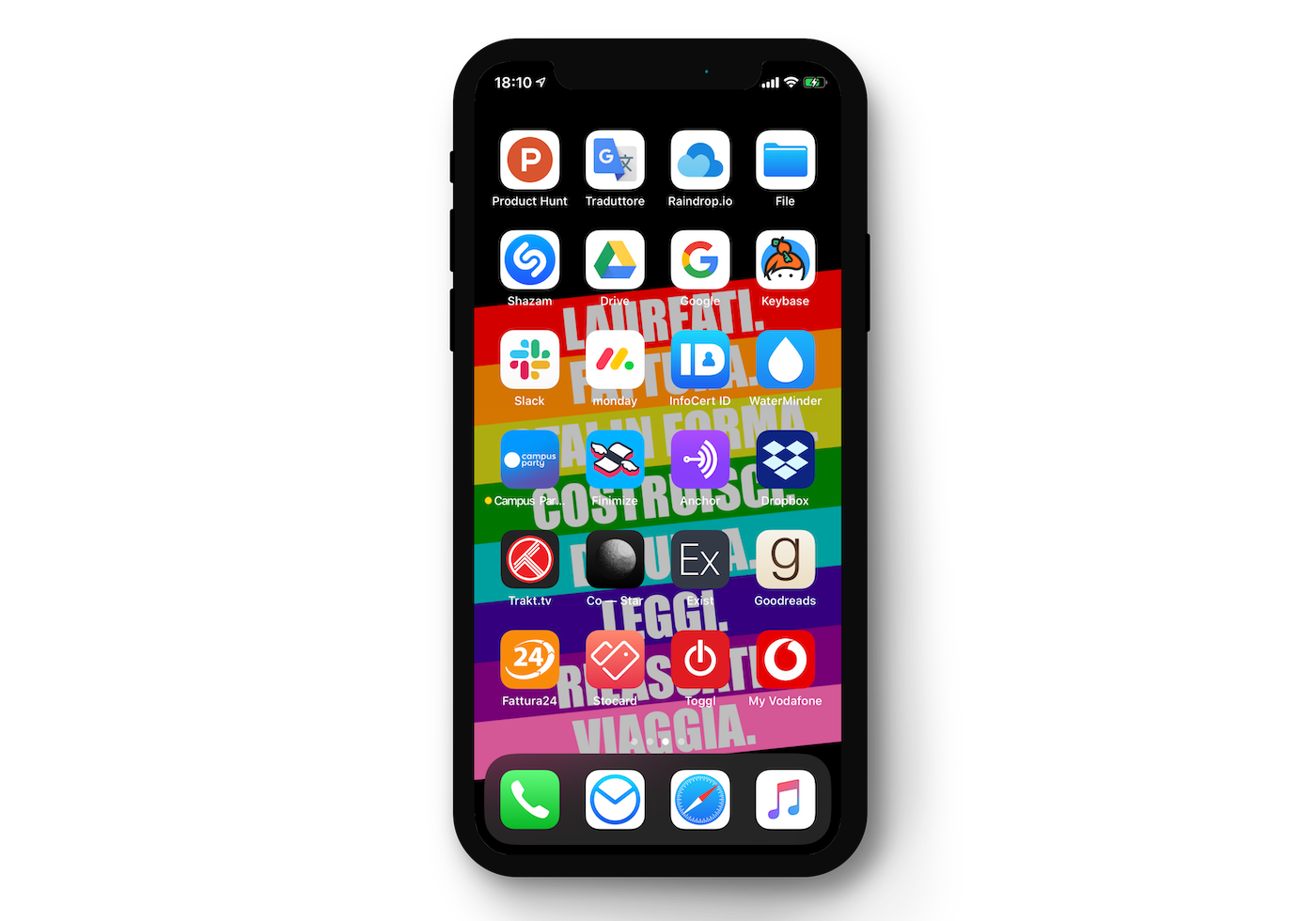
In every smartphone there are apps that we use more and that we use less. But there are also those apps that we have, but that we want to use only the strictly necessary. Those are the apps to put on the second page, dedicated to rarely used and to avoid apps.
The arrangement of apps on this page is not dictated by ease of reach, but by simplicity of memorization: in my example, I arranged the apps with icons colored from light (white) to dark (black / red). It is not important to be precise with colors and gradation progression, because just remembering which color is in which row is enough, so the eye will immediately fall on a certain row if it wants to find the app of a certain color.
On this page there are work apps (Slack, Monday) that it is better to use as little as possible on the smartphone but that must be there in cases of ‘urgency’; leisure apps (Goodreads, Trakt.tv, Shazam) and other apps that are important to have at hand, but not to have on the front page.
Third page: folders
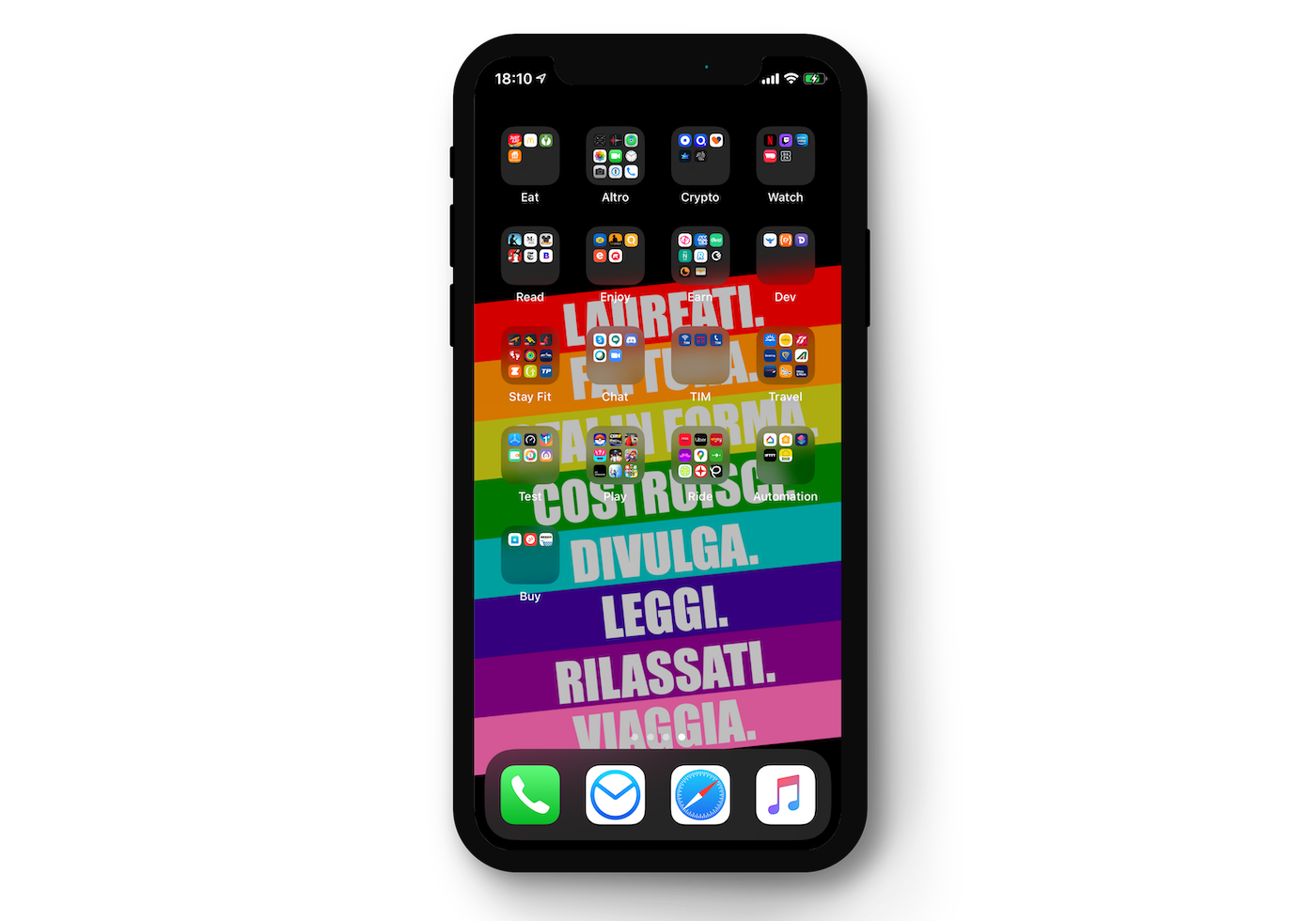
The third page is very simple: if apps remain, they are arranged in folders. Personally, I have Apple apps and all apps that have an interface that I use little (for example: I almost never use the 1Password app because I use the autofill feature directly throughout the operating system) in the same ‘Other’ folder, and then I group the other apps in folders that basically have the verb that represents them as a name: for example, JustEat, TheFork and Quandoo are all apps that allow me to eat, so the folder is called Eat; Netflix, VVVID, DAZN, Amazon Prime Video are all apps that allow me to watch (TV series, movies, etc.) so the folder is called Watch; and so on.
Widget page: quick glances
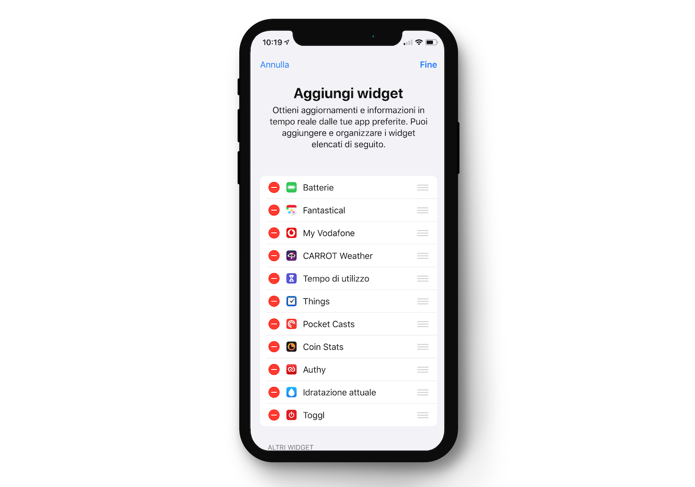
To be honest, I use the widget screen little, but I still configured it according to a small scheme: apps whose widgets give me enough information I need without opening the app. And in general, although in the photo I put 11 widgets, in reality I really only use the first 4, which I see without scrolling: battery, calendar (Fantastical), internet counter (MyVodafone) and weather (CARROT Weather).
Dock: classics
What apps to put in the dock? I have practically never asked myself this question, because for me the apps in the dock must be the ones that are used absolutely the most, and for me they are exactly the apps that Apple arranges by default: Phone, Mail (which in my case is replaced by Airmail), Safari (which at times I replace with Brave) and Music.
I hope I have given someone a hand to better understand how to arrange their apps on the smartphone. I reasoned a lot about it and in the end I believe that this method, set of criteria, is very reasonable and above all universal.

Giacomo Barbieri
Head of Growth at Routescan. Building at the intersection of crypto infrastructure and AI agents.